Sunday, October 31, 2010

eleventh post

1. What was it like using your hand as subject matter for a drawing?

Using my hand as subject matter for a drawing was difficult because it was hard to look at my hand and draw it, especially when drawing with my less dominant hand. It's difficult to transfer a 3D image onto paper and still make it look 3D.


2. What media did you select - pencil or charcoal? Why?

I selected pencil because it was easier to correct mistakes I made. With charcoal, it would have been easier to create shadows but harder to fix blemishes. Pencil is much easier to control compared to charcoal.
3. How did it feel to create a drawing with your non-dominant hand?

Creating a drawing with my non-dominant hand was so difficult! I already can't write or draw anything of significance with my left hand to begin with, but trying to make a hand was hard. It took a lot of concentration to look at my hand and be able to create steady lines with my left hand.


4. Compare and contrast your final drawings. Do you think they are successful studies?

I think they are successful studies but could be better. With more practice, I think my left-handed drawing could be almost as good as my right-handed drawing. The drawing of my right hand had a weird shadow that covered parts of my fingers and the palm of my hand, and when trying to shade it, the hand looks like it has werewolf hair on it. The drawing of my left hand is slightly better.


5. Would you consider using your non-dominant hand to create artwork in the future?

I would absolutely not consider using my left hand to create artwork. It would look horrible, and almost like a five year old drew it. I do not consider that to be art.


Friday, October 29, 2010

tenth post

1. Explain why you selected each of the FOUR videos you choose from the selection listed above.

 I picked the Leonardo da Vinci: The Mind of the Renaissance, The Drawings of Michelangelo, Velazquez, and La Primavera videos. I picked the first three videos because I like the works of da Vinci, Michelangelo, and Velazquez. I picked La Primavera because in high school, I took Spanish, and 'la primavera' means, 'the spring'. I was interested to see what this video would be about.

2. For each video list/discuss the key concepts you learned.

Leonardo da Vinci: The Mind of the Renaissance: At the age of twenty, Leonardo is accepted into the painters' guild, and his creative imagination serves the pomp of the Medici court well. He caricatures the faces of the men involved in the slander against him.

The Drawings of Michelangelo: Michelangelo's surviving drawings reveal his perfectionism and his techniques. The conflicting forces of Michelangelo's passionate response to the male form and his intensely felt Christian faith are the driving forces of his art.

Velazquez: Velazquez is influenced by the Italian masters. Much of his work is based on an earlier age, and the work of another artist. "Surrender of Breda" is an example of Velazquez' "artlessness." Velazquez is an idealist from a vantage point above reality. He uses his mind's eye to capture the essence of a king personality characterized by stasis, but full of inner movement and emotion.

La Primavera: Though it is a secular painting, "La Primavera" evokes religious sentiments. Venus and Cupid can be seen in the same light as the Virgin and Child, the most popular painting motif of the time.  Historians speculate that the painting was originally commissioned for the marriage of Lorenzo's nephew and his young bride.


3. How do the videos relate to the readings in the text?

These videos relate to the readings in the text because this week, we read about the Renaissance time period and also the Baroque and Rococo styles of art.


4. What is your opinion of the films? How do they add depth to understanding of the readings and art concepts?

I found the films very interesting. They add depth to the readings because they involve what we are reading currently. The videos give examples and details that the book did not give, and because of this, it enhances my understanding of the subject material.

Friday, October 22, 2010

ninth post

1. Explain why you selected each of the three videos you choose from the selection listed above.

I chose Cataclysm: The Black Death Visits Tuscany, The Measure of All Things: Greek Art and the Human Figure, and The Birth of the Middle Ages. I picked all three of these videos because they all had interesting titles.


2. For each video list/discuss the key concepts you learned.

 In the More Human Than Human video I learned that Egyptians created images of the body in a consistent way for 3000 years because of their culture. "Culture is king" when it comes to artistic depiction of the human form.


In the Cataclysm: The Black Death Visits Tuscany video, a key concept I learned was that painting changed in significant ways after the Plague. Figures emerge flatter than in the previous century. Taddeo di Bartolo paints gruesome images of hell. Post-Plague art is less realistic than the earlier masters such as Giotto.

A key concept I learned in the video The Measure of All Things: Greek Art and the Human Figure was that the Acropolis is a visual reminder of the politics, philosophy, art, and architecture of ancient Greece. Artists portrayed humans in a realistic way and were obsessed with perfection of the body.


The Birth of the Middle Ages video taught me that for 800 years, the Roman Empire was the center of the world, the focus and source of all political, military, and civil activity. Rome fell because of internal decay and external pressure from outsiders and invaders, in specific the Huns.


3. How do the videos relate to the readings in the text?

 The videos relate to the readings in the text because the videos and the text both talk about cultures mixing together, art in the Middle Ages, and different types of pottery painting styles for vases in Greece.

4. What is your opinion of the films? How do they add depth to the understanding of the readings and art concepts?

I think the films are interesting and help explain a lot of what we read in the books.  They give great examples of the different aspects of particular types of art, and explain in detail how that type of art came into light.

Sunday, October 10, 2010

eighth post

1. Hyperlink the Blogs you reviewed into your Blog

http://damisam01.blogspot.com/
http://lostprofetsun.blogspot.com/
2. When looking at Project #1: (Elements and Principles), did you agree with the element or principle the artist listed with the images? Did you see other elements and principles in the images?

 Well, for damisam01's blog, there was no first project. But for lostprofetsun's project, I agreed with most, but not all, of the photos taken. I definitely saw other elements and principles in the images. For example, for Value, I saw it as more of a 'color' photograph rather than a symbol for value.


3. When looking at Project #2: Where there any images in the Peer Blogs the same as your own? If yes, what were they? Where the reasons the image was selected the same or different as your own?

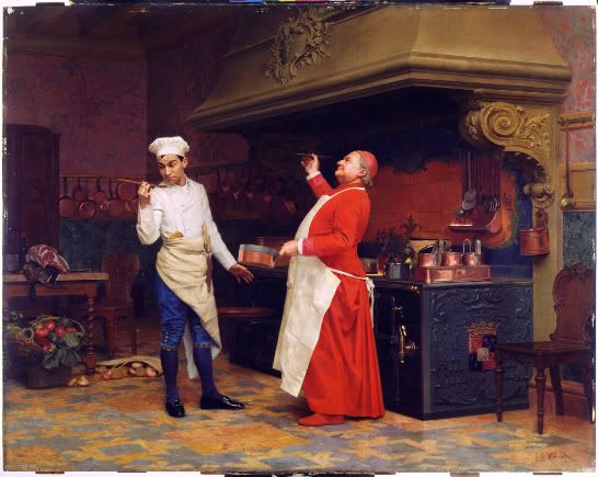
 Yes, there were images in my peers' blogs that were the same as my own. lostprofetsun also picked The Marvelous Sauce and Springtime. damisam01 and I did not have any works of art in common for this project. We had similar reasons for picking Springtime, but not for The Marvelous Sauce. lostprofetsun picked that work because of it's detail, and I picked it because of my connection of cooking through the piece.


4. Where there any images that your Peers selected that pique your interest now? If yes, what are they and what is your connection with them? What would you want to know about them?

Yes, there were a few pieces that piques my interest. One of them was a painting by Sue Williams, one which the title wasn't given in the blog. I like the colors and the technique used by the artist. Another artwork I am interested in is Ice Cream Being Tasted 1964 by Claes Oldenburg. I like this piece because it's a piece about ice cream! What's not to love?


5. What do you think about  the process of reading your peers reflection? Do you find this to be a valuable in your learning?

I think reading my peers reflection on their projects helped me critique their work easier. I found it valuable in my learning because it helped me see what they were seeing and get inside their heads while looking at each subject for a photograph or each painting.


6. Check your Blog and read comments posted by your Peers. Do you find their comments helpful?

I didn't necessarily find them helpful but I enjoyed seeing their positive reactions to my projects. It is encouraging to see that those who have seen my work like it and will help me know what to do for projects that follow.

Sunday, October 3, 2010

seventh post

1) Which artworks make an impact or impression on you? List 3 different artworks.

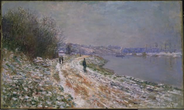
Tow-Path to Argenteuil
Claude Monet
ca. 1875
Oil on canvas

Tow-Path to Argenteuil by Claude Monet made an impact on because it reminds me of home. The snowy scene in this painting reminds me of North Tonawanda near the canal.  I like the technique that Monet used to paint the winding path that leads your eye from the bottom right of the work to the middle and background.

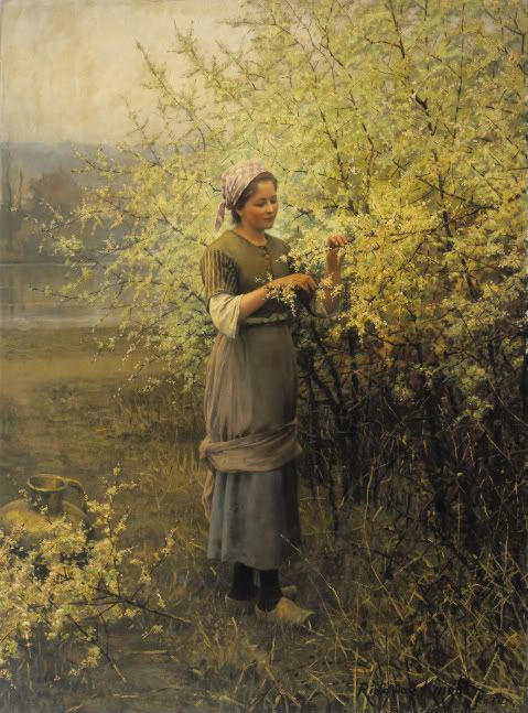
Springtime
Daniel Ridgway Knight
ca. 1890
Oil on canvas

Springtime made an impression on me because of the fact it is such an incredible work of art. The face of the girl in this painting looks like a photograph instead of made with oil paints. There is such an immense amount of detail in this work, from the shadowing of the creases in the girl's clothes to colors of the ground.


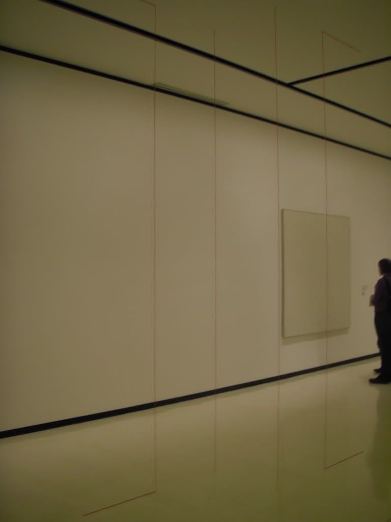
Untitled (Sculptural Study, Four Part Vertical Construction)
Fred Sandback
ca. 1982/2004
Acrylic Yarn

This piece made an impression on me because I don't find it worthy of it being labeled 'art'. All this work is, is four pieces of red yarn stretching from floor to ceiling. However, this work also stood out to me for a very obvious reason; it was in the middle of the room; it broke the boundaries of a picture frame.

2) Which artworks do I feel like I have a connection with and why? List 3 different artworks.


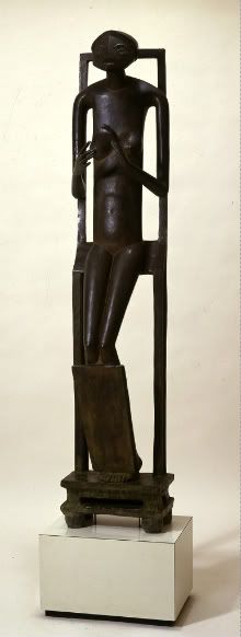
Invisible Object (Hands Holding the Void)
Alberto Giacometti
1934
Bronze

I feel like I have a connection with this sculpture because of the fact that human beings are never truly satisfied with what they have. There's always a want, or a desire, that keeps them feeling just a little bit empty. The emptiness in this sculpture is displayed by the subject's empty hands, indicating that there is a void in their life that they wish to fill.

The Marvelous Sauce
Jehan Georges Vibert
ca. 1890
Oil on wood panel

I have a connection with this painting for the mere fact I love to cook and bake, so obviously I was drawn to this picture. I enjoy that the two people are emphasized by the color of the clothes they are wearing in the rather dreary colored kitchen.

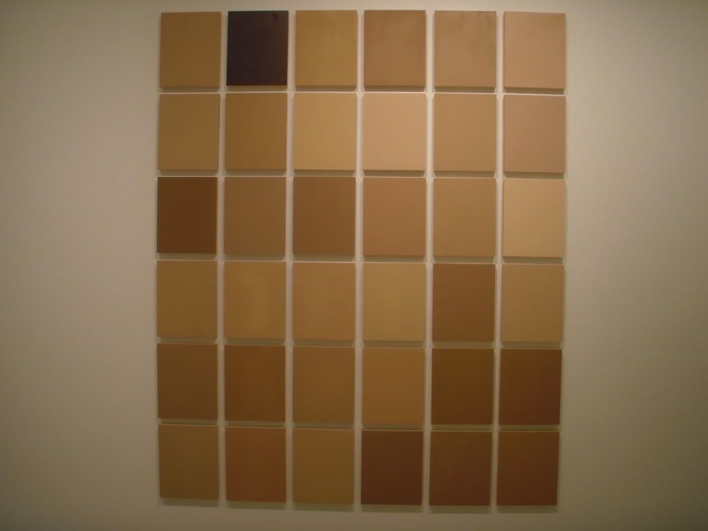
Commission for Synecdoche
Byron Kim
2008
Oil & wax on wood


When I first saw this work, I immediately made the connection that each individual square represented some sort of skin tone. I put my arm up and compared my skin to each, trying to figure out which one mine was closest too. Because of my reaction, I feel like I have a connection with it because it represents every type of person, including me.

3) Which artworks would I like to know more about and why? List 3 artworks.

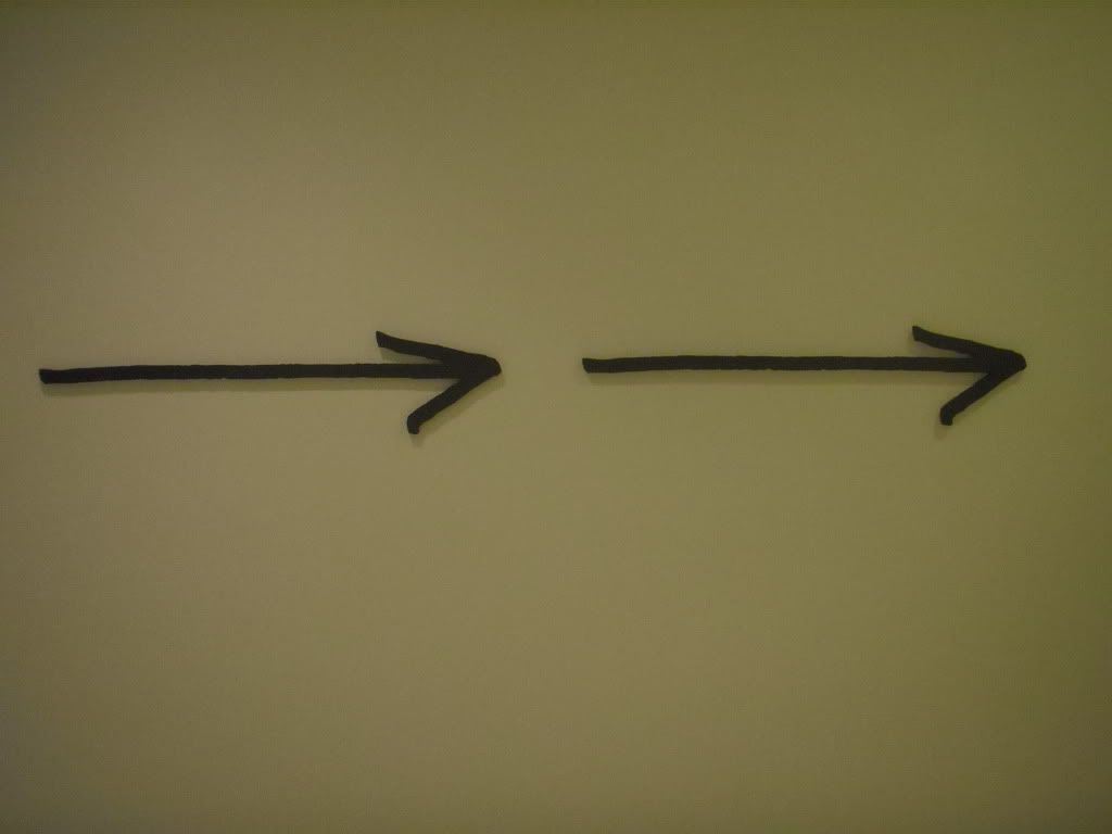
 Nine Arrows Leading You Around the Space
 Micah Lexier
2010
Waterjet-cut aluminum with enamel paint

This is a picture of just two of the nine arrows, which actually do lead you completely around the first floor and even direct you toward the stairs that head to the second floor. I would like to know what inspired Lexier to make these arrows, why there are only nine and not ten, and where he is from. Each arrow has text that is imprinted onto it, and one of them reads "This is an arrow pointing at something I remember seeing on an earlier visit." This must mean he has been to the Albright-Knox before.

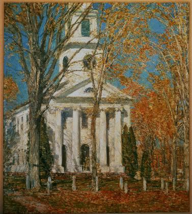
Church at Old Lyme, Connecticut
Fredrich Childe Hassam
1905
Oil on canvas

What I would like to know more about this piece is what technique Hassam used to create such vivid colors and the leaves on the fall trees. This piece is beautiful, despite the fact that it's merely a painting of a church. The scenery is beautiful and I understand why Hassam felt the need to paint such a work.

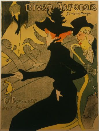
Divan Japonais (Japanese Sofa)
Henri de Toulouse-Lautrec
1893
Color lithograph paper

This piece intrigues me because it doesn't really resemble real life in the least. What I want to know more about this piece is what inspired the artist to make it, what it should be interpreted as, and how lithograph paper is used to make art.

Friday, October 1, 2010

sixth post

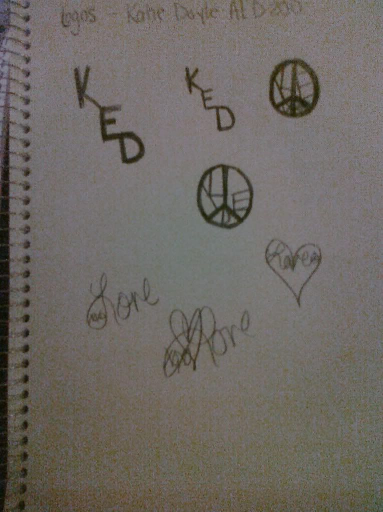
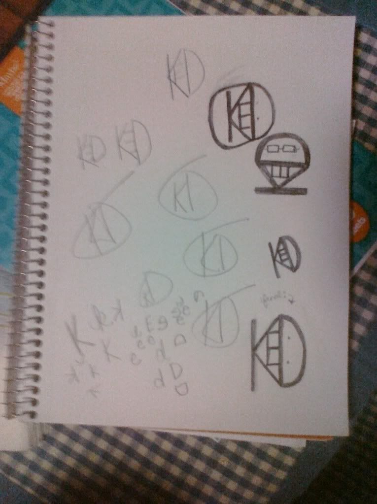
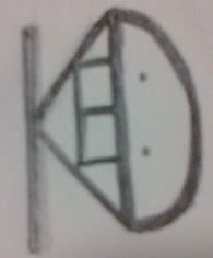
While creating my logo, the most important thing I kept in mind was that the logo is supposed to reflect who I am. I'm personally a fan of peace signs, so at first I tried creating a symbol that revolved around that. However, I realized that a peace sign is a symbol/logo of it's own, so i scratched the idea. I temporarily moved onto attempting to make a logo out of my signature, which involves a heart, a cursive 'love', and 'xoxo' within the loop of the 'L'. I didn't get far, and proceeded onto something else. I ended up trying to make pictures out of the use of my initials, KED. While making the logo, I had to remember that it had to be simple yet complex. If the logo is too complicated, people get lost in the details and the logo itself is lost. Nothing is simpler than text. The most important discovery I made in the creation of my logo was that while it doesn't exactly reflect my personality as much as I wanted it to, it was fun to make and therefore worth the time and effort that I put into it. The most important information I learned from watching the provided resources were the different types of logos. They are character logos, word logos, figurative logos, and combination logos. My final logo design is a character logo, because it involves single characters and abbreviations, and isn't a complete word.

first page;


second page;


final product;