Sunday, December 12, 2010

twenty-third post

1. Which assignment did you ENJOY working on the best? Why?
I enjoyed working on the elements and principles of design project the best because I really enjoy taking pictures. Plus it was a nice way to go out and enjoy the warm weather!

2. Which assignment did you ENJOY working on the least? Why?
I wasn't really a fan of the first project of making the color wheel and the value scale, mostly because I had just done those things last year in some of my art classes at my old college. It was a nice refresher but just didn't appeal to me as much as it did the first time around.
 
3. How did you like using ANGEL?
Using ANGEL really helped me learn how to use it better than I had learned in BSC101. I finally understand how to use and navigate the website.

4. If you had the opportunity to change this course:
What would you keep? Everything besides....
What would you remove? Not doing so many art gallery visits.
What would you add? n/a

5. Would you recommend this course to your peers? Yes I would recommend this course to my peers.

6. Please list any other comments you would like to share. thank you for a wonderful semester!

twenty-second post

Final Reflection of AED 200

1. What were your expectations for this course and where they met?
 My expectations for this course were to learn about every aspect of art, including history, its influence in different cultures, different types of medias, etc. These expectations were met.
2. Now that you've been through this course, What is art? How would you define it now compared to your intial posting?
I believe that after experiencing this course, art is the result of someone being influenced and expressing themselves using that influence as inspiration.

3. Who was your favorite artist in your original posting and who is your favorite visual artist now? If there is a difference, why do you think so? If you have the same favorite artist, why do you think so?
In my original posting, I put that Vincent Van Gogh was my favorite visual artist. It is still true. I think he is still my favorite because I always enjoy looking at his artwork.

4. Now that you've completed this course, how do you feel about taking an online course? Is your answer the same as it was in your first posting? How is it the same or different?
Taking an online course was easier than I first expected it to be. I thought it would be hard to remember to check it every week, plus do the homework when I didn't have a class to go to every other day to remind me.

twenty-first post

Self-PortraitVincent Van Gogh
1889, oil on canvas
25.5" x 21.75"


Self-PortraitWilliam John Wilgus
c. 1837-1942, oil on canvas


Self Portrait with monkey
Frida Kahlo
1938, oil on masonite


1. Why did you select the inspiration pieces?
I selected these inspiration pieces because I really admire the unique techniques they each used to paint themselves. I've always loved Van Gogh's paintings, with the swirls in the backgrounds and how realistic it is even with flowing lines to color in and shade.
2. Why did you select the media to create your self-portrait?
I selected digital/computer media to create my self-portrait because I feel like it really captures who I am. Being in a modern age, my life would be altered drastically if I didn't have access to a computer or the internet.
3. What challenges did you face in creating your self-portrait and how did you overcome them?
The only challenge I faced was trying to locate self portraits in the art gallery. I knew what I wanted to do with my own self portrait but couldn't find any portraits that reflected what I wanted to do or could possibly inspire me. I overcame this by looking harder in the gallery, and found some portraits to use.
4. How does this piece represent you?
This piece represents me because ever since I was younger, I was always attached to the computer. Using the computer as my media seemed like the only logical thing to do. I was born with blonde hair and blue eyes. I take pride in my blue eyes, which this media really accentuates.
5. What elements and principles of art did you apply in this work?
In this work, I applied emphasis, value, color, repetition, and shape. Emphasis and color are shown because of my eyes. Value is shown because of the difference in the white of my cheeks and the dark of the couch I'm sitting on. Repetition and shape are demonstrated in the rectangular blinds behind me.
6. Did you enjoy working on this project?
I enjoyed working on this project because it gave me a reason to go to the art gallery, which I enjoy going to but never have the time to. I liked trying to figure out a way to capture who I am in a self portrait.
7. What do you think of your final artwork?
I think my final artwork came it pretty well; I like it better than the original picture.

original photo:
Final product.


Thursday, December 9, 2010

twentith post

1. Which projects did you review?

I reviewed The Art of War by Darrell Corathers, Wonders of Life by Emily Graham, and A Closer Look by Jenna Aiello.

2. Why did you select the Exhibit you critiqued?
I selected the exhibit I critiqued, The Art of War, because I felt a personal connection with it. I have a friend who is overseas right now fighting in Afghanistan.

3. What challenges did you face in writing the critique article and how did you overcome them?
The only challenge I faced when writing the critique article was how to start it. I overcame this challenge by googling "how to start a critique paper" and got some tips.


4. How do you feel about critiquing your peers work?
I hate people in general critiquing my work, let alone my peers. However, I don't feel their opinion is necessary or relevant so I guess it's alright.

5. Would you like to read the critique your peers wrote about your Art Curation Project?
No, I would not like to read the critique my peers wrote about my project.


6. On a scale of 1-10 how would you rate your finished article and why?
If one is the worst and ten is the best, I would give my finished article somewhere between a 6 and a 7. I think this because I wasn't entirely sure what I was critiquing on and how to write what I was critiquing, and I believe that will affect my grade.

7. Did you enjoy working on this project?
Yes, I enjoyed working on this project.

Wednesday, December 8, 2010

ninteenth post

1. For each video list/discuss the key concepts you learned.


Greenberg on Art Criticism: An Interview by T. J. Clark: According to Clement Greenberg, "writing about visual art is much tougher than writing about literature or music". He reads the work of music critic Tovey to remind himself "how to be relevant". Clement Greenberg and T.J. Clark discuss art critics such as Ruskin and Degaro. Ruskin's essays on art and architecture were extremely influential in the Victorian and Edwardian eras.

Greenberg on Pollock: An Interview by T. J. Clark: Critic Clement Greenberg remembers Jackson Pollock in the 1940s when he was told Pollock would one day be a great painter. In the summer of 1947, Jackson Pollock painted his first spatter-drip piece. When he received the Guggenheim Award, Pollock explains that he will paint large, movable pictures that will function between the easel and the mural. Greenburg states that Pollock was an outsider but practical and pretentious.

An Introduction to the Italian Renaissance: Giorgio Vasari’s Lives of the Artists has been the basis of art criticism since the 16th century. The discussion between Master Vasari and his apprentice reveals the innovations of artists such as Giotto, Ghiberti, and Donatello. Images selected in this video illustrate the Roman influence on Renaissance art and reinforce the concepts of perspective, balance, chiaroscuro, composition, and realism.
 
The Critics: Stories from the Inside Pages: This film is about the journey of Dr. Dwight DeWerth-Pallmeyer to answer the question, “How do critics serve the public and the artistic community?" Pallmeyer interviews people such as Good Morning America film reviewer Joel Siegel and Time magazine film critic Richard Schickel. The result is an in-depth look at criticism as an art form.

The Colonial Encounter: Views of Non-Western Art and Culture: Using photographs, film clips, and posters from the fair with commentary from renowned art historians the program lays bare a celebration of foreign ethnicities, that is seen now as a spectacle of Eurocentric myopia. Offerings from collections and museums across the world are also featured. The result is a look at the ways in which western prejudice.

Jackson Pollock: Michael Fried and T. J. Clark in Conversation: This video shows a discussion between two critics, T.J. Clark and Michael Fried. Clark is concerned primarily with the sociopolitical history of art.  Fried is a proponent of aesthetically based views of painting and sculpture. The video shows how the two artists try to obtain common ground. The two critics study Lavender Mist and Autumn Rhythm, two pieces of art by Jackson Pollack.

2. Do the videos relate to the creation of your Art Criticism project? If yes, explain how. If no, explain why not.

 Yes, these six videos relate to the Art Criticism project because the videos cover the views of critics and show the process of how real critics analyze and review art. By watching these videos it helped me to complete my project.

3. What is your opinion of the films? Do they add depth to understanding of art criticism?

I thought the films were interesting. They add depth to understanding of art criticism by showing how the process works. They also discuss in depth the careers or critiques and show how they do their job.

Sunday, December 5, 2010

eighteenth post

Creating my Art Exhibit was definitely a challenge and took a lot of time. To find my pictures, I went to ArtSTOR and looked up pieces of work using the key words "friendship" and "people". I got what I wanted, though I wish I had more variety when it came to the pieces. There are many paintings, a couple photographs, and very few sculptures. In my gallery, I would make sure to use a neutral paint color to assure that the paint on the wall wouldn't overshadow the glory of the work of art. I enjoyed the project, though. I can't wait to see other people's projects!

Wednesday, November 24, 2010

seventeenth post

1. For each video list/discuss the key concepts you learned. The Lowdown on Lowbrow: West Coast Pop Art: Artist Anthony Aussang says that 'Lowbrow Art' is essentially reactionary to highbrow culture. The dictionary definition is, "a person regarded as uncultivated and lacking in taste."
Displaying Modern Art: The Tate Approach: Modern art in the Museum of Modern Art from 1929 onwards was displayed primarily in chronological order, representing each art movement. Art is displayed on white walls with flexible lighting. Critics argue that Tate Modern's thematic presentation of art requires that viewers have no knowledge of art. They believe art should be more than entertainment. The Tate are provided with striking and often abrupt transitions between the individual display rooms.

Bones of Contention: Native American Archaeology: Native Americans' bones were collected as a scientific curiosity during the U.S. genocide against Indians. Anthropologists differ on whether or not the remain should be returned to their ancestors. Native Americans have ceremonies to discover whether the bones are their ancestors or not. Their past is conveyed through an oral tradition. Native Americans do not want the scientists' history.
George Eastman House: Picture Perfect: By creating the first affordable, user-friendly camera George Eastman became the father of popular photography. The museum established at his home celebrates the contributions he and the company he founded have made to advance the art, science, and phenomenon of photography. The photography collection at George Eastman House is a visual history of photography that represents the work of 14,000 amateur and professional photographers. The collection includes all types of photographs, famous and obscure, from documentary to fine art.
 2. Do the videos relate to the creation of your Art Exhibition project? If yes, explain how. If no, explain why not.
Yes, the videos relate to the creation of my Art Exhibition project because the videos discuss different exhibitions (such as the George Eastman House) and the way those exhibitons are arranged. There are different ways of arranging artwork. Chronology is one of them, or there could simply be no pattern at all, as shown by Tate Modern.

3. What is your opinion of the films? Do they add depth to understanding of the art concepts you practiced while creating your curation project?

I thought the films were very interesting and definitely helped me understand the concepts I need to know for creating my curation project. Before watching the films I had no idea how I was going to start my project, and now I have some sort of idea on how to display and choose the pictures I plan on using.

Wednesday, November 17, 2010

sixteenth post

1. Explain why you selected each of the FOUR videos you choose from the selection listed above.
 This week, I picked Isamu Noguchi: The Sculpture of Spaces, Abstract Expressionism and Pop: Art of the '50s and '60s, Hockney on Photography, and Andy Warhol: Images of an Image. I picked the Andy Warhol video because from what I've seen of his work, I really like him. I picked the Hockney video because I like photography. I picked Abstract Expressionism and Pop because I don't think I've ever really seen art from those two time periods, besides from the graphic design aspect. Lastly, I picked the Isamu Noguchi video because the title caught my eye.

2. For each video list/discuss the key concepts you learned.

Isamu Noguchi: Sculptor Isamu Noguchi creates sculpture gardens to "humanize space and sculpture." Noguchi's childhood holds many clues to his interest in sculpture gardens and to his feelings of isolation.
Abstract Expressionism and Pop: Abstract Expressionism was born from a joining of attitudes in American art and European avant-garde art, but was later rejected for its nonfigurative and seemingly egocentric character in favor of the ultra-objective phenomenon known as Pop Art. By using Franz Kline's painting "C&O," abstract art is compared to figurative art. The filled space of the canvas is distinctively different in these two styles.
Hockney on Photography: David Hockney discusses the void between the person behind the camera and the subject. He aims to take away the void. Hockney uses photographic images to create something pertaining more to the condition of painting. Hockney experiments with photography over a five-year period in the 1980s. He claims to have made a lot of discoveries, including discoveries about himself.
Andy Warhol: Andy Warhol worked as a commercial artist until 1960 when he began experimenting with advertising images. He worked until his untimely death in 1987. One process he used for his artwork was Silk Screening. Silk Screening is when photographs are blown up and developed onto silk screens; they are transferred to paper and canvas, using ink and paint. 


3. How do the videos relate to the readings in the text?

These videos relate to the readings in the text because this week, we read about the photography and its artists, such as Andy Warhol. The videos also relate to the readings in the text because it refers back to things we've learned about in previous chapters, such as the invention/discovery of certain medias and also different processes.


4. What is your opinion of the films? How do they add depth to understanding of the readings and art concepts?

I thought the films were interesting and definitely helped me understand the material covered in the book better. They add depth to the understanding of the readings because they give great examples and amazing detail. 

Sunday, November 14, 2010

fifteenth post


Questions about the exhibit:
1. What is the title of the exhibit? Forty: the Sabres in the NHL
2. What is the theme of the exhibition?
The theme of this exhibition is to show the history of the Sabres in the National Hockey League.

Questions about the physical space:
1. What type of lighting is used? Low lighting with accented spotlight lighting on the photos
2. What colors are used on the walls? beige, white, and dark blue.
3. What materials are used in the interior artchitecture of the space? marble
4. How is the movement of the viewer through the gallery space? linear with rooms branching off


 Questions about the artwork:
1. How are the artworks organized? Stacked, placed next to & above each other. 3 in a row
2. How are the artrworks similar? All about the Sabres.
3. How are the artworks different? Different time periods, different media, black & white photography vs. colored.
4. How are the artworks framed? Simple medium-thick black frame
5. How are the artworks identified and labeled? Photographer credit in bottom left corner of the photograph.
6. What is the proximity of the artwork to each other? They are spaced closed together depending on how they are grouped.
What did you think of visiting the Gallery and purposefully looking at the exhibition from a different perspective - the physical space, the architecture, theme, etc.?

I enjoyed visiting the Gallery. With the assignment in mind, I looked at the exhibition trying to find a similar aspect of each photograph to see why they were placed the way they were.


PHOTO BY: BOB SHAVER
This photo is of a Sabres goalie. The year was not stated, but it isn't a recent photo. The goalie is wearing a mask but no helmet, has padding and a jersey on, and is also holding their hockey stick. The player's jersey is blue, white, and yellow. Their number is 30.

This photo uses line, color, and emphasis. The poles of the goal and also the goalie's hockey stick draws your eye to the goalie on top of the goal, which is the main subject of this photo. Color is used because of its media; it is a photograph taken in color. Emphasis is used because the background of the photo is blurry while the goalie and goal are crisp, making the background irrelevant.


PHOTO BY: BILL WIPPERT

This photo is of a player after either passing or shooting the puck. The year was not stated, but it isn't a recent photo. The player is wearing a white helmet, and their uniform which consist of blue, yellow, and white. Their number is 19.

This photo uses line, color, emphasis, and repetition. Color is used because of the use of color photography. Line is used because of the lines of the uniforms and also because of the way the Sabres player's body is. Emphasis is used because the player on his side in mid-air is the focus of the photo due to his different stance. Repetition is used because of the line of Sabres players on the bench in the background watching the game. They are all white in race and are wearing Sabres jerseys.


PHOTO BY: BILL WIPPERT

This is a photo of two players hugging after what I assume to be a goal scored during an important game. The two players are on the Sabres and both are wearing blue, yellow, and white uniforms. They are holding their hockey sticks and wearing helmets. This photo isn't a recent photo, but again the year was not cited.

This photo uses elements and principles of line, color, emphasis, unity, and repetition. Color, unity, and repetition are used because of the players' jerseys; they are both yellow, blue, and white in color and have strips on the sides of the shorts and on the socks. Unity is also used because they are physically unified in a hug. Line is used because the one leg of the skater and the hockey stick of the player draw your eye into the middle of the photograph, where the "action" is taking place.

Saturday, November 13, 2010

fourteenth post

1. Explain why you selected each of the FOUR videos you choose from the selection listed above.
I selected the videos Expressionism, Dada and Surrealism, The Impact of Cubism, and Mattise and Picasso. I picked Expressionism, Dada and Surrealims, and The Impact of Cubism because they are movements we have been recently talking about and are also movements I learned at my old college. I chose the Mattise and Picasso video because they are two of my favorite artists, specifically Picasso.

2. For each video list/discuss the key concepts you learned.
Expressionism: An outgrowth of Fauvism, Expressionism emphasized color's emotional properties while demonstrating far less concern than the Fauves had with the formal and structural composition of color. Contemporary Neo-Expressionism has further developed this artistic approach.
Dada and Surrealism: The Dada movement, born as a reaction to World War I, and its successor, Surrealism, opened new avenues for artistic creation by striving to bypass the reasoning process and tap directly into the unconscious mind.
The Impact of Cubism: Influenced by the works of Cézanne, African tribal art, and the art of the Iberian peninsula, Cubism—the most influential style of the early 20th century—offered European artists unfamiliar, nonclassical ways to represent form and space.
Matisse and Picasso: By the time both had become renown, Picasso and Matisse had broken with tradition with the establishment. Gertrude Stein is the first to recognize the greatness of Matisse (1905) and Picasso. Matisse is deliberate, rational, and very French in the way he organized his thoughts. Picasso is a worker, impulsive, and immerses himself in his painting. "Les Mademoiselles d'Avignon" (1907) and Matisse's " and Matisse's paintings of females are compared.


3. How do the videos relate to the readings in the text?
The videos relate to the readings in the text because these movements are what we read about in chapter twenty-one. In chapter twenty-one, we read about De Stijl, Expressionism, Dada, Cubism, Surrealism, and many other movements in the 19th and 20th centuries.


4. What is your opinion of the films? How do they add depth to understanding of the readings and art concepts?

I thought the films were interesting. They add depth to the understanding of the readings because the videos were about the art movements we have been studying the whole week.

Saturday, November 6, 2010

thirteenth post

1. Upload the three (3) inspiration images to your Blog (or link to your Photobucket account).

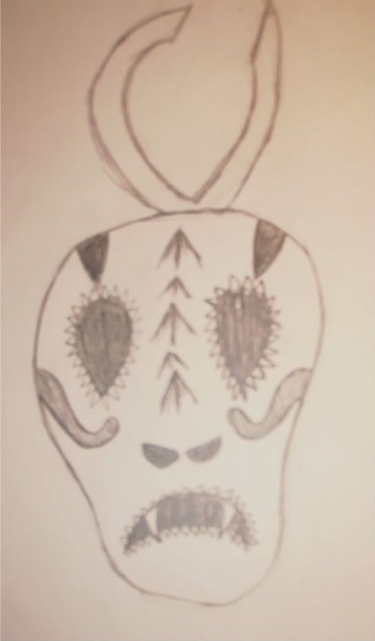
The above mask is the goli kplekple mask from Africa. I picked this mask as one of my inspiration images because of its simplicity. It is made out of wood and pigment. From this mask, I took the idea of the antler-looking piece from the top of the mask.


This mask is a Beijing Opera Mask. I picked this mask as one of my inspiration images because of it's simple shape and style but bold colors. From this mask, I am picking the general shape of the mask.


This is a Bolivian devil mask from Oruro. I picked this mask as one of my inspiration images because i liked the fun, bright colors and the style that the eyes are. From this mask, I am picking it's colors, decoration around the eyes, and spikes down the center from the top to the nose.


2. Include the analysis and description (art criticism steps) of the three (3) inspiration pieces.

 Goli kplekple mask:
description: This mask is made in a simple disk-shaped design and lacks a complex form and ornamentation. It has a basic engraving around the edge of the mask, using basic triangles. The eyes are a simple upside-down teardrop shape. The mouth is simply two small, raised rectangles with repeating raised triangles facing each other as if they were teeth.
analysis: This mask uses the principles and elements of design such as shape, repetition, pattern, and texture. The shapes used for this mask are a circle, teardrop, triangle, and rectangle. The repetition used for this mask is along the outer edge, using the triangles against each other with a curved hypotenuse to create the 'inner circle'. The same is also applicable with pattern. Texture that is used is the raised eyes and mouth, which are above the main, flat surface.
Beijing opera mask:
description: This mask is a fat oval shape with a somewhat flattened top and a rounded chin. It has distinct and bold colors, and also a somewhat intricate way of how it was painted. The mask is black, white, red, and yellow, with small circles cut out where the eyes are. The shape of the eyes are realistic, being painted white. The cut out circles are just big enough where the pupils will fit. The design painted on this is mostly very fluid with no sudden edges painted.
analysis: This mask uses the principles and elements of design such as color, line, value, and balance. The colors used are red, black, white, and yellow. Line is used to draw your eyes from the outside of the mask to the nose, or from the nose to the outside. Value is used because of the different shades of color, specifically black and white. Balance is demonstrated because the mask is vertically symmetrical.
Bolivian devil mask:

description: This mask is has a basic shape of a face with exaggerated cheek bones. From the top of the mask straight to the nose, there is raised spikeds, like a mohawk. On the nose there is a snake. There are two teeth in the mouth, one on each side of the bottom jaw. There are very vivid colors used; yellow, red, blue, and green, all in varying shades and hues. The mouth is cut out, and also two 'nose' holes, along with a small cut out above the eyes.
analysis: This mask uses the principles and elements of design such as color, line, emphasis, and shape. Color is used because, obviously, the mask is painted using incredible color. Line is portrayed through the decoration around the eyes, as well as the implied line created by the spikes. Emphasis is used by the use of the snake, which is on the nose and the focal point of the mask. Your eye is drawn to it immediately. Shape is used for the shape of the eyes, the actual mask, and the snake.


3. Upload images of your sketches and finished piece.


this is my first mask, along with sketches of ideas for each aspect of it.


this is my final piece.


4. Explain how you used the Elements and Principles in your finished mask.
I used the elements of shape, line, and value. I portrayed shape with the shape of the eyes, nostrils, and mouth, as well as the shape of the actual mask. I portrayed line with the decorative, curvy lines but also with straight lines too. Lastly, value is portrayed in my mask because of the shading on the spikes on the front of the mask. I used the principles of balance, repetition, dominance, unity, and variety. I used balance because the mask is symmetrical except for the antler-looking piece. I used repetition because the pattern around the eyes and the mouth is repeated, and also the spikes on the front are also repeated. The eyes are the dominating factor in this mask because of how big they are. Unity and variety are portrayed because there are different lines, shapes, etc. but they are all unified.


5. Share your opinion of your finished mask and what you thought about creating the mask.
I really liked my finished mask. While creating it, I tried to keep in mind the elements and principles I really enjoyed from my inspiration images and wanted to apply those to my mask. I had fun making this mask because I could create practically anything I wanted, as long as it was a mask.

Friday, November 5, 2010

twelfth post

1. Explain why you selected each of the FOUR videos you choose from the selection listed above.

I selected the videos African Art, Buddhism, The Great Wave, and Islamic Art: Africa and Central Asia. I chose African Art and Islamic Art: Africa and Central Asia purely because I am very interested in the different styles, mediums, etc. that are used in Africa. For the Buddhism video, I picked it because I love the concept of Buddhism and want to know that besides religious influence, how Buddhism is related to art. Lastly, I picked <i>The Great Wave<i> because ever since middle school, I've loved anime and everything Japanese, so it was an obvious pick when it came down to it.
 
2. For each video list/discuss the key concepts you learned.

African Art:  In the villages of sub-Saharan Africa where traditions are still strong, art is an integral part of daily life. Indigenous African religious beliefs are explored through rituals—a spiritual form of performance art—and funerary statuary. The oldest existing African art is found in drier regions. Ancient bush paintings represent animals and humans; these stylized pictures may be a wish for luck in the hunt.
Buddhism: The key to Buddhist teaching is "tanha," the extinguishing of all desires and all things that feed the ego the ego and obstruct enlightenment. Within one hundred years of Buddha's death, Buddhism split into two groups: "hinayana" and "mahanyana." During and after the Golden Age of Buddha, Buddhist art and architecture flowered across India.
The Great Wave: Hokusai’s The Great Wave is arguably the best-known image of Japanese art in the Western world today. Full of mystery and contradiction, Hokusai's "The Great Wave" epitomizes Japan's art and culture. Its image appears on everything from coffee mugs to high fashion while political cartoonists and tattoo artists also subvert its image.
Islamic Art: Africa and Central Asia: Art scholar Waldemar Januszczak explores Islamic art and architecture across Central Asia and Africa. The prolific accomplishments of Ottoman Empire architect Minar Sinan are described; 30 of more than 100 mosques he built still stand in Istanbul.


3. How do the videos relate to the readings in the text?

The videos relate to the readings in the text because for chapters 18, 19, and 20, art from the regions in the videos are discussed. The videos show many kinds of examples of the art in specific areas and in different ways, such as sculptures or architecture.

4. What is your opinion of the films? How do they add depth to understanding of the readings and art concepts?
I thought the films were interesting and definitely helped me understand the material covered in the book better. They add depth to the understanding of the readings because they give great examples and amazing detail.

Sunday, October 31, 2010

eleventh post

1. What was it like using your hand as subject matter for a drawing?

Using my hand as subject matter for a drawing was difficult because it was hard to look at my hand and draw it, especially when drawing with my less dominant hand. It's difficult to transfer a 3D image onto paper and still make it look 3D.


2. What media did you select - pencil or charcoal? Why?

I selected pencil because it was easier to correct mistakes I made. With charcoal, it would have been easier to create shadows but harder to fix blemishes. Pencil is much easier to control compared to charcoal.
3. How did it feel to create a drawing with your non-dominant hand?

Creating a drawing with my non-dominant hand was so difficult! I already can't write or draw anything of significance with my left hand to begin with, but trying to make a hand was hard. It took a lot of concentration to look at my hand and be able to create steady lines with my left hand.


4. Compare and contrast your final drawings. Do you think they are successful studies?

I think they are successful studies but could be better. With more practice, I think my left-handed drawing could be almost as good as my right-handed drawing. The drawing of my right hand had a weird shadow that covered parts of my fingers and the palm of my hand, and when trying to shade it, the hand looks like it has werewolf hair on it. The drawing of my left hand is slightly better.


5. Would you consider using your non-dominant hand to create artwork in the future?

I would absolutely not consider using my left hand to create artwork. It would look horrible, and almost like a five year old drew it. I do not consider that to be art.


Friday, October 29, 2010

tenth post

1. Explain why you selected each of the FOUR videos you choose from the selection listed above.

 I picked the Leonardo da Vinci: The Mind of the Renaissance, The Drawings of Michelangelo, Velazquez, and La Primavera videos. I picked the first three videos because I like the works of da Vinci, Michelangelo, and Velazquez. I picked La Primavera because in high school, I took Spanish, and 'la primavera' means, 'the spring'. I was interested to see what this video would be about.

2. For each video list/discuss the key concepts you learned.

Leonardo da Vinci: The Mind of the Renaissance: At the age of twenty, Leonardo is accepted into the painters' guild, and his creative imagination serves the pomp of the Medici court well. He caricatures the faces of the men involved in the slander against him.

The Drawings of Michelangelo: Michelangelo's surviving drawings reveal his perfectionism and his techniques. The conflicting forces of Michelangelo's passionate response to the male form and his intensely felt Christian faith are the driving forces of his art.

Velazquez: Velazquez is influenced by the Italian masters. Much of his work is based on an earlier age, and the work of another artist. "Surrender of Breda" is an example of Velazquez' "artlessness." Velazquez is an idealist from a vantage point above reality. He uses his mind's eye to capture the essence of a king personality characterized by stasis, but full of inner movement and emotion.

La Primavera: Though it is a secular painting, "La Primavera" evokes religious sentiments. Venus and Cupid can be seen in the same light as the Virgin and Child, the most popular painting motif of the time.  Historians speculate that the painting was originally commissioned for the marriage of Lorenzo's nephew and his young bride.


3. How do the videos relate to the readings in the text?

These videos relate to the readings in the text because this week, we read about the Renaissance time period and also the Baroque and Rococo styles of art.


4. What is your opinion of the films? How do they add depth to understanding of the readings and art concepts?

I found the films very interesting. They add depth to the readings because they involve what we are reading currently. The videos give examples and details that the book did not give, and because of this, it enhances my understanding of the subject material.

Friday, October 22, 2010

ninth post

1. Explain why you selected each of the three videos you choose from the selection listed above.

I chose Cataclysm: The Black Death Visits Tuscany, The Measure of All Things: Greek Art and the Human Figure, and The Birth of the Middle Ages. I picked all three of these videos because they all had interesting titles.


2. For each video list/discuss the key concepts you learned.

 In the More Human Than Human video I learned that Egyptians created images of the body in a consistent way for 3000 years because of their culture. "Culture is king" when it comes to artistic depiction of the human form.


In the Cataclysm: The Black Death Visits Tuscany video, a key concept I learned was that painting changed in significant ways after the Plague. Figures emerge flatter than in the previous century. Taddeo di Bartolo paints gruesome images of hell. Post-Plague art is less realistic than the earlier masters such as Giotto.

A key concept I learned in the video The Measure of All Things: Greek Art and the Human Figure was that the Acropolis is a visual reminder of the politics, philosophy, art, and architecture of ancient Greece. Artists portrayed humans in a realistic way and were obsessed with perfection of the body.


The Birth of the Middle Ages video taught me that for 800 years, the Roman Empire was the center of the world, the focus and source of all political, military, and civil activity. Rome fell because of internal decay and external pressure from outsiders and invaders, in specific the Huns.


3. How do the videos relate to the readings in the text?

 The videos relate to the readings in the text because the videos and the text both talk about cultures mixing together, art in the Middle Ages, and different types of pottery painting styles for vases in Greece.

4. What is your opinion of the films? How do they add depth to the understanding of the readings and art concepts?

I think the films are interesting and help explain a lot of what we read in the books.  They give great examples of the different aspects of particular types of art, and explain in detail how that type of art came into light.

Sunday, October 10, 2010

eighth post

1. Hyperlink the Blogs you reviewed into your Blog

http://damisam01.blogspot.com/
http://lostprofetsun.blogspot.com/
2. When looking at Project #1: (Elements and Principles), did you agree with the element or principle the artist listed with the images? Did you see other elements and principles in the images?

 Well, for damisam01's blog, there was no first project. But for lostprofetsun's project, I agreed with most, but not all, of the photos taken. I definitely saw other elements and principles in the images. For example, for Value, I saw it as more of a 'color' photograph rather than a symbol for value.


3. When looking at Project #2: Where there any images in the Peer Blogs the same as your own? If yes, what were they? Where the reasons the image was selected the same or different as your own?

 Yes, there were images in my peers' blogs that were the same as my own. lostprofetsun also picked The Marvelous Sauce and Springtime. damisam01 and I did not have any works of art in common for this project. We had similar reasons for picking Springtime, but not for The Marvelous Sauce. lostprofetsun picked that work because of it's detail, and I picked it because of my connection of cooking through the piece.


4. Where there any images that your Peers selected that pique your interest now? If yes, what are they and what is your connection with them? What would you want to know about them?

Yes, there were a few pieces that piques my interest. One of them was a painting by Sue Williams, one which the title wasn't given in the blog. I like the colors and the technique used by the artist. Another artwork I am interested in is Ice Cream Being Tasted 1964 by Claes Oldenburg. I like this piece because it's a piece about ice cream! What's not to love?


5. What do you think about  the process of reading your peers reflection? Do you find this to be a valuable in your learning?

I think reading my peers reflection on their projects helped me critique their work easier. I found it valuable in my learning because it helped me see what they were seeing and get inside their heads while looking at each subject for a photograph or each painting.


6. Check your Blog and read comments posted by your Peers. Do you find their comments helpful?

I didn't necessarily find them helpful but I enjoyed seeing their positive reactions to my projects. It is encouraging to see that those who have seen my work like it and will help me know what to do for projects that follow.

Sunday, October 3, 2010

seventh post

1) Which artworks make an impact or impression on you? List 3 different artworks.

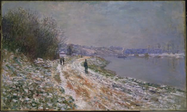
Tow-Path to Argenteuil
Claude Monet
ca. 1875
Oil on canvas

Tow-Path to Argenteuil by Claude Monet made an impact on because it reminds me of home. The snowy scene in this painting reminds me of North Tonawanda near the canal.  I like the technique that Monet used to paint the winding path that leads your eye from the bottom right of the work to the middle and background.

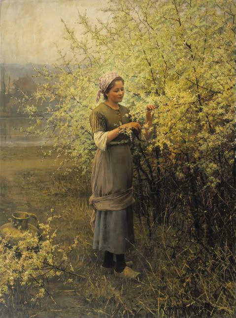
Springtime
Daniel Ridgway Knight
ca. 1890
Oil on canvas

Springtime made an impression on me because of the fact it is such an incredible work of art. The face of the girl in this painting looks like a photograph instead of made with oil paints. There is such an immense amount of detail in this work, from the shadowing of the creases in the girl's clothes to colors of the ground.


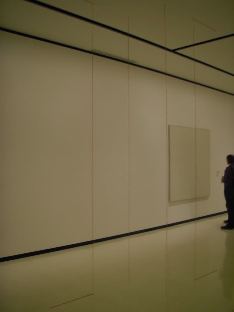
Untitled (Sculptural Study, Four Part Vertical Construction)
Fred Sandback
ca. 1982/2004
Acrylic Yarn

This piece made an impression on me because I don't find it worthy of it being labeled 'art'. All this work is, is four pieces of red yarn stretching from floor to ceiling. However, this work also stood out to me for a very obvious reason; it was in the middle of the room; it broke the boundaries of a picture frame.

2) Which artworks do I feel like I have a connection with and why? List 3 different artworks.


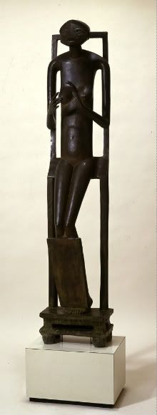
Invisible Object (Hands Holding the Void)
Alberto Giacometti
1934
Bronze

I feel like I have a connection with this sculpture because of the fact that human beings are never truly satisfied with what they have. There's always a want, or a desire, that keeps them feeling just a little bit empty. The emptiness in this sculpture is displayed by the subject's empty hands, indicating that there is a void in their life that they wish to fill.

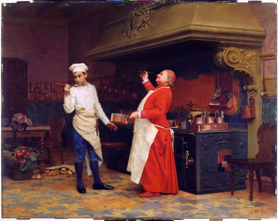
The Marvelous Sauce
Jehan Georges Vibert
ca. 1890
Oil on wood panel

I have a connection with this painting for the mere fact I love to cook and bake, so obviously I was drawn to this picture. I enjoy that the two people are emphasized by the color of the clothes they are wearing in the rather dreary colored kitchen.

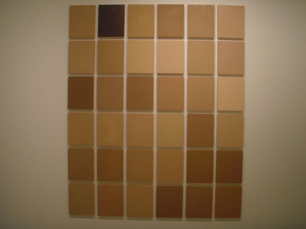
Commission for Synecdoche
Byron Kim
2008
Oil & wax on wood


When I first saw this work, I immediately made the connection that each individual square represented some sort of skin tone. I put my arm up and compared my skin to each, trying to figure out which one mine was closest too. Because of my reaction, I feel like I have a connection with it because it represents every type of person, including me.

3) Which artworks would I like to know more about and why? List 3 artworks.

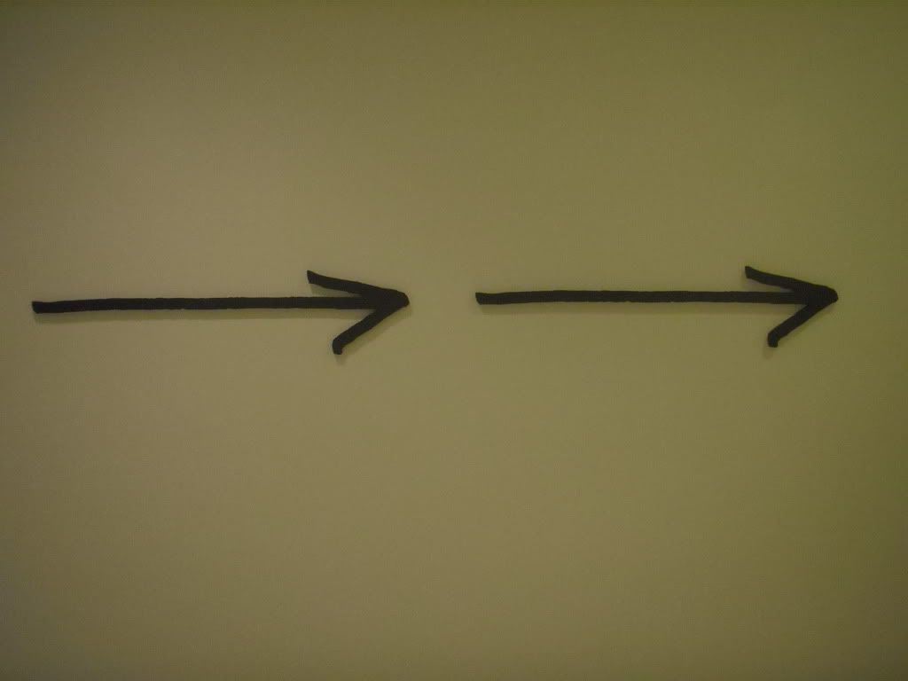
 Nine Arrows Leading You Around the Space
 Micah Lexier
2010
Waterjet-cut aluminum with enamel paint

This is a picture of just two of the nine arrows, which actually do lead you completely around the first floor and even direct you toward the stairs that head to the second floor. I would like to know what inspired Lexier to make these arrows, why there are only nine and not ten, and where he is from. Each arrow has text that is imprinted onto it, and one of them reads "This is an arrow pointing at something I remember seeing on an earlier visit." This must mean he has been to the Albright-Knox before.

Church at Old Lyme, Connecticut
Fredrich Childe Hassam
1905
Oil on canvas

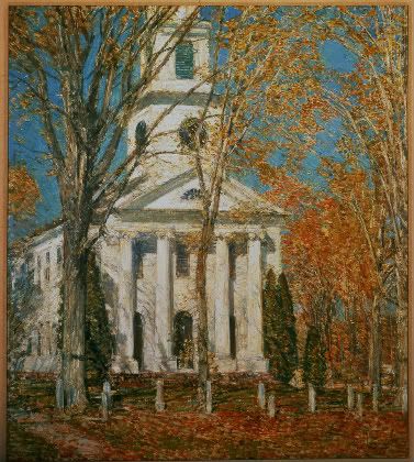
What I would like to know more about this piece is what technique Hassam used to create such vivid colors and the leaves on the fall trees. This piece is beautiful, despite the fact that it's merely a painting of a church. The scenery is beautiful and I understand why Hassam felt the need to paint such a work.

Divan Japonais (Japanese Sofa)
Henri de Toulouse-Lautrec
1893
Color lithograph paper

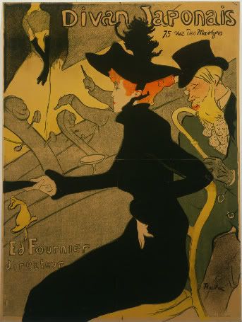
This piece intrigues me because it doesn't really resemble real life in the least. What I want to know more about this piece is what inspired the artist to make it, what it should be interpreted as, and how lithograph paper is used to make art.

Friday, October 1, 2010

sixth post

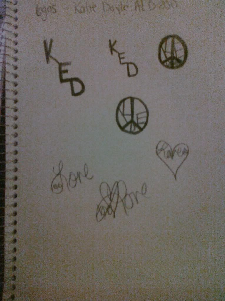
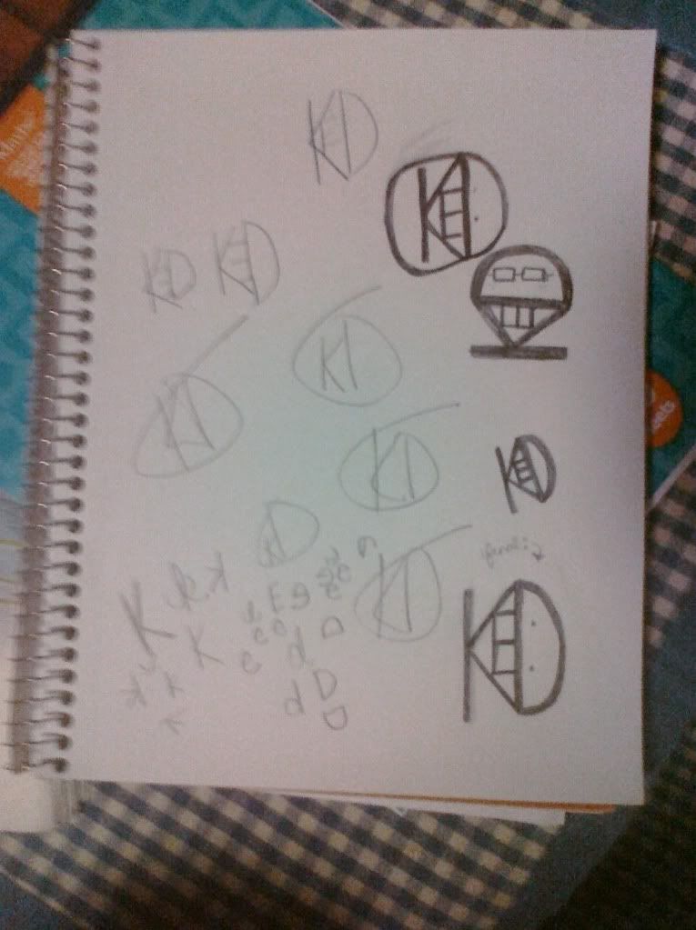
While creating my logo, the most important thing I kept in mind was that the logo is supposed to reflect who I am. I'm personally a fan of peace signs, so at first I tried creating a symbol that revolved around that. However, I realized that a peace sign is a symbol/logo of it's own, so i scratched the idea. I temporarily moved onto attempting to make a logo out of my signature, which involves a heart, a cursive 'love', and 'xoxo' within the loop of the 'L'. I didn't get far, and proceeded onto something else. I ended up trying to make pictures out of the use of my initials, KED. While making the logo, I had to remember that it had to be simple yet complex. If the logo is too complicated, people get lost in the details and the logo itself is lost. Nothing is simpler than text. The most important discovery I made in the creation of my logo was that while it doesn't exactly reflect my personality as much as I wanted it to, it was fun to make and therefore worth the time and effort that I put into it. The most important information I learned from watching the provided resources were the different types of logos. They are character logos, word logos, figurative logos, and combination logos. My final logo design is a character logo, because it involves single characters and abbreviations, and isn't a complete word.

first page;


second page;


final product;

Saturday, September 25, 2010

fifth post


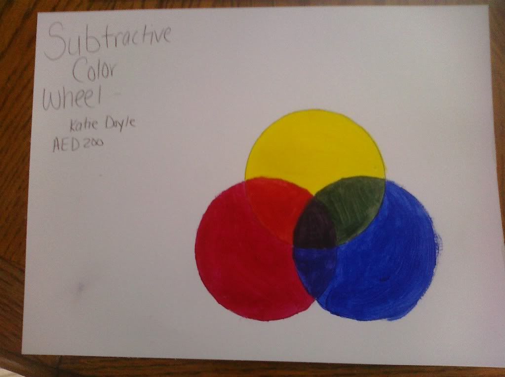
I think creating the Value Scale and the Color Wheel were helpful to show how colors mix together and the variation of values that a work of art can have. However, making the Value Scale seemed kind of basic, because I've done it before a bunch of times. I liked working with the acrylic paint more than working with graphite because mixing the paints to become the perfect shade was challenging. Painting took a lot of concentration and precision which I preferred over trying to figure out the appropriate value for the square I would be working on. Working with a pencil, I think, was harder because it was difficult to get the values lighter and lighter. I think the most important information I learned from watching the two videos for this project where learning how to combine the colors and how to use graphite to make the value scale.


Saturday, September 18, 2010

fourth post

1. Describe Color and it's effects on emotions. Use the appropriate vocabulary of color in your posting.

Color is created by the reflection of light on different pigments. Different colors make viewers feel different things. Red is a passionate color usually associated with anger, while yellow has been described as making people feel hungry and cheerful. The feelings that colors invoke are what are most important and difficult for an artist to create.

2. What is a theoretical aspect of color that most intrigues/fascinates you? Why?

I think that the fact that colors invoke more feelings than just primary feelings is intriguing. By primary, I mean sad, mad, happy, etc. McDonald's was painted yellow to unconsciously encourage customers to buy more to eat. It's incredible that colors impact our mood without even trying.

3. In the Color video, what made the biggest impact on you in regards to color and its effects on emotions?

 Seeing the finished product of the Scottish painter's painting made a big impact on me in regards to color and its effect on emotions. When the painting, inspired by Venice, was finished, seeing the colors clash yet mingle was amazing and created a mood that I don't know how to describe.


4. In the Feelings video, what made the biggest impact on you in regards to color and it's effects on emotions? 

Color can be used to create feelings and also create emphasis. Using all different elements and principles can assist the creation of emotions, such as shape and line. Using jagged lines and deep reds, browns, and blacks can create a violent, terrifying feeling, while swirly lines with blues, greens, and yellow create a calm, happy feeling.

third post


"Create a Blog Posting for the reflection journal on the creative and technical processes you followed."

The creative process of taking these pictures came to me easier than I thought it would when I saw the playground, basketball court, and school where most of these pictures took place. Keeping each principle and element of design in mind, finding 'models' for each was easy as pie. I would think of the word 'proportion' and look around, find something that could be easily interpreted as such, and just pressed the button. After taking the pictures, I uploaded them and edited them slightly to make them look more appealing using photoshop.com, whose editing system is very easy to use.

Friday, September 10, 2010

second post

1. For each video list/discuss the key concepts you learned.

In both videos, I learned what aesthetics are, and the evolutionary origins of art and aesthetics. These origins can be classified with sexual seletion, group selection, inter-subjective communication and social bonding, and by-product of brain evolution.

2. Which philosopher's theroy on aesthetics do you feel is most important? Be sure to mention the philosphers name, era (time in history), and contribtion to the aesthetic theory in your response.
I believe that Immanuel Kant, an 18th century German philosopher, has the most important theory on aesthetics. In his works on aesthetics, he argues our judgement is what makes us able to experience beauty and grasp experiences as part of an ordered, natural world with purpose.


3. What do you think about Changeux and Ramachandran scientific view of aesthetics and art? What was the most interesting fact you discovered from each speakers lecture?
I think that Changeux's and Ramachandran's views of aesthetics and art were interesting. I liked that they pointed out how certain things you see stimulate brain activity, and they showed pictures of the brain and what areas of the brain are active.

4. How do the videos relate to the readings in the text?

In both the videos and the text, aesthetics is discussed in depth about what it is, how to define it, etc. They both also talk about iconography and the laws of art, how to describe art, and how to discover and process the meaning of art.

5. What is your opinion of the films? How do they add depth to understanding of the topics in your reading? 

I think the films were interesting, but too long. It was hard to understand Changeux in the second film because of his accent, plus the quality of both films were bad so it was hard to see what the Powerpoints said to be able to take notes.

Friday, September 3, 2010

first post

1. How was the process of creating the GMail account and setting up the Blog?
2. What do you expect to learn in this course?
3. How do you feel about taking an online course?

Creating the GMail account, along with setting up the Blog, was incredibly easy. I expect to learn about the history of art in this course, and also expect to learn different techniques for creating art. I'm nervous about taking this online course because I'm afraid I will forget to check Angel or any of my other accounts and end up failing the course.